Fitbit Charge 5 Review: The perfect middle ground
It’s been a while since I gave up the Apple Watch in favor of Fitbit (because of reasons). I have used both Versa 2 and Versa Sense in rounds, before I realized that I don’t even want to notice that I have something tied to my arm. It should just be there, not constantly reminding me of it – thus the choice fell on Fitbit Luxe. However, I’m not hiding any facts here, I have a few times thought that the screen was a little TOO small, as I sometimes had to stop during a run to see what is actually on it. But that will change now, as Fitbit has just launched the new Fitbit Charge 5 and I have been super keen on testing!
Design
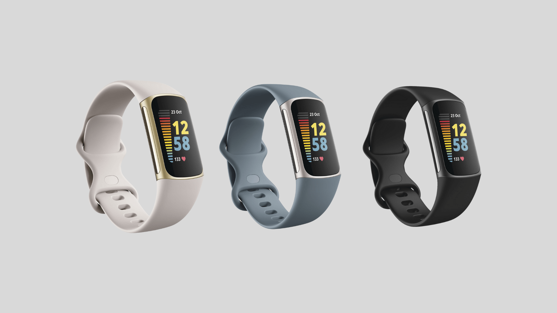
The Fitbit Charge 5 boasts a totally overhauled design. And even though it isn’t backward compatible with wristbands from previous models, the new design is defintely worth it. Ditching the square edges, the Charge 5 has a nice rounded design, actually similar to the Fitbit Luxe.
The new super-durable stainless steel chassis comes in three finishes: Graphite, Soft Gold, and Platinum. Plus, there are plenty of replacement band options to match any business, casual or sporty style.
Features and controls
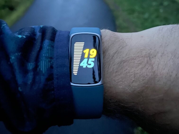
Apart from its physical design, the other significant new visual feature with the Charge 5 is its excellent new colour AMOLED display with increased brightness. It’s a huge step up from the boring monochrome OLED panel on past versions of the tracker and makes way for more colorful and creative watch faces like on the Sense, Versa series, and of course, the previously mentioned Luxe.
Fitbit has also added an Alway-On Mode this time, to view the time and your essential metrics at a glance.

Unfortunately there are no physical buttons on the Charge 5, instead Fitbit have added a double-tap gesture that takes you to the main clock screen. This kinda works as intended, but it doesn’t feel great. A few times when I double-tap to go back, it activates the option that’s on screen instead of going back. A minor issue but still annoying.
Regarding all the health tracking features and/or smart features I’m not gonna cover them here at this time, since this is basically a Fitbit Versa software wise.
Battery
Fitbit’s battery was what made me switch from Apple Watch in the first place. And this time Fitbit promise seven days of battery life on the Charge 5. This despite the fact that the tracker has become 10 percent thinner since the Charge 4.
This seems to be accurate and sometimes I get more than the promised seven days. But as usual, you have to settle for fewer days if you use the GPS a lot, or if you use the always on display.
And, when you do have to charge the Charge 5, you no longer need the absurd plastic clip that previous models used. Like the Luxe, the Charge 5 connects to the charger using magnets.
Verdict
The Fitbit Charge 5 is the perfect middle ground between a basic fitness tracker and an all-out smartwatch. It’s also the ideal alternative to the Apple Watch if you’re looking for something more fitness-focused and less bulky in size and software. As with the Luxe you wont barely feel that you have it on your wrist, making it perfect even to sleep with.
PROS
- Sleek and modern design
- Light and comfortable
- Affordable
CONS
- Somewhat clumsy touch gestures
The Fitbit Charge 5 was sent to me for free for review, but I did not get paid to write this. The thoughts on this product are my own. You can grab it from one of these swedish sites (or Fitbit.com).


